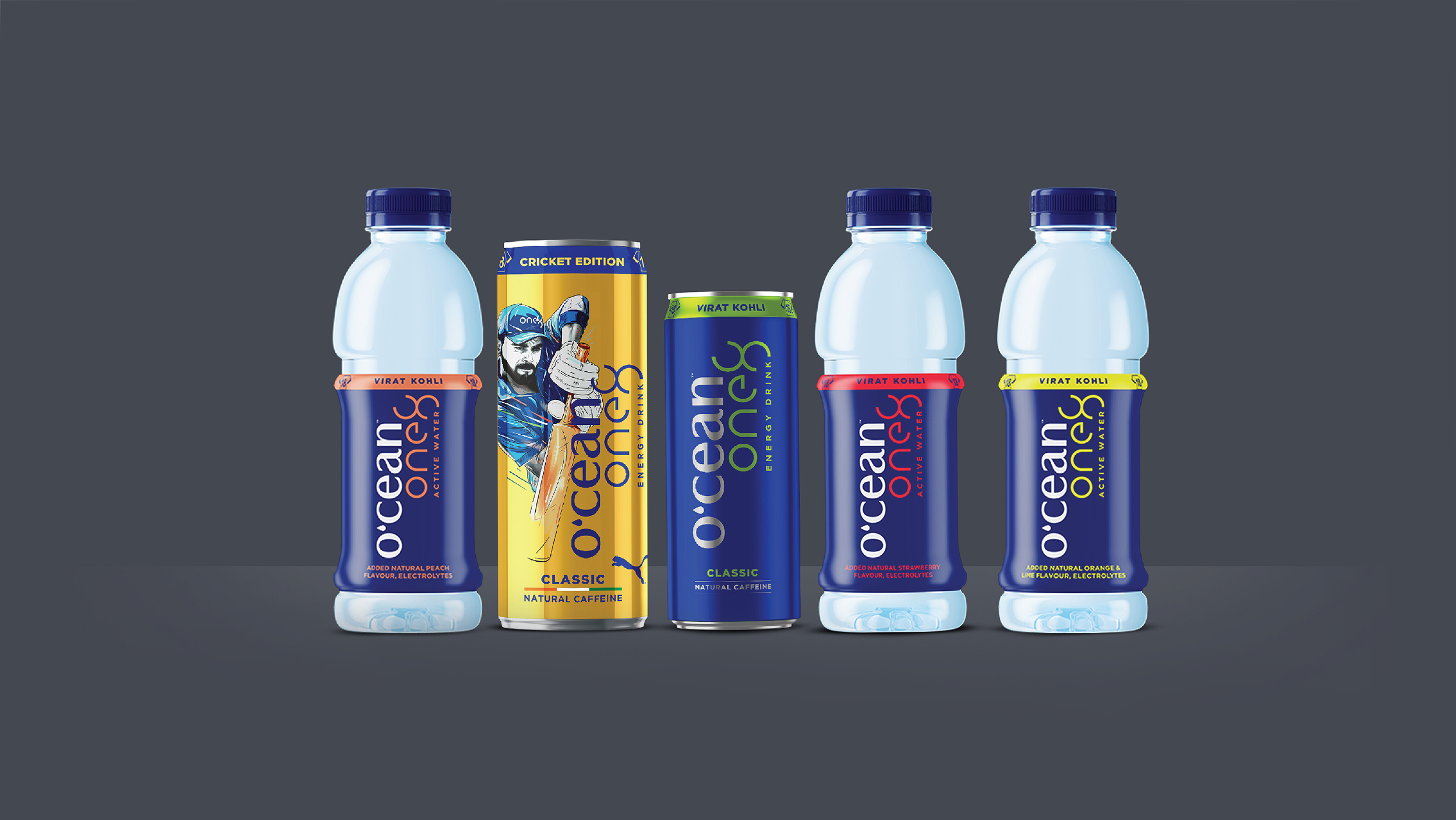
O’cean one8 packaging is very cluttered and the vertical logo is not prominent enough.

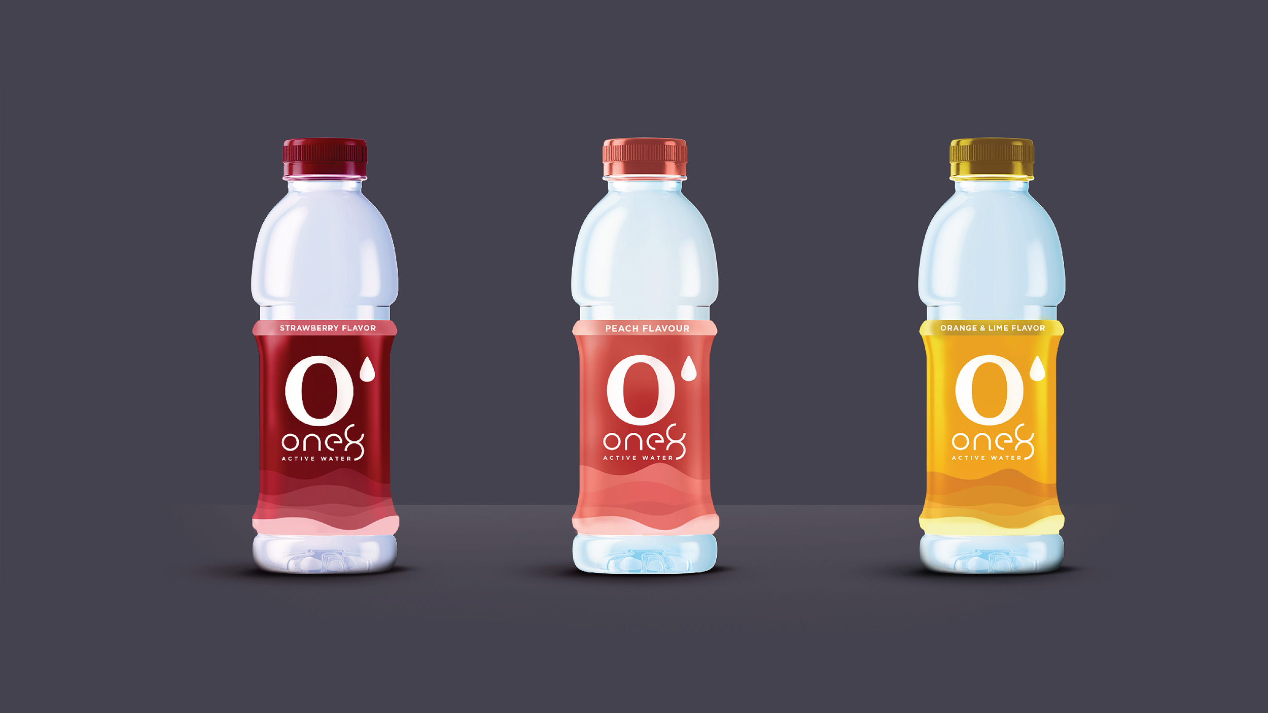
So we took O’ from the O’cean one8 logo.
We used ocean waves to design can
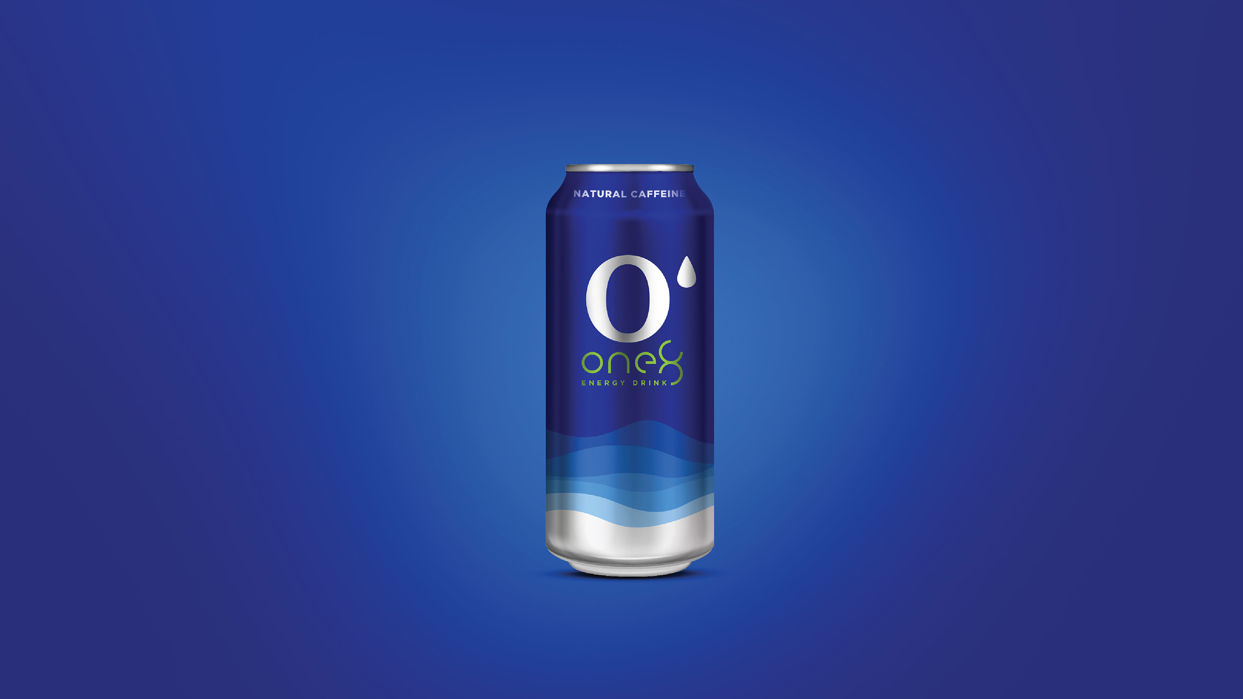
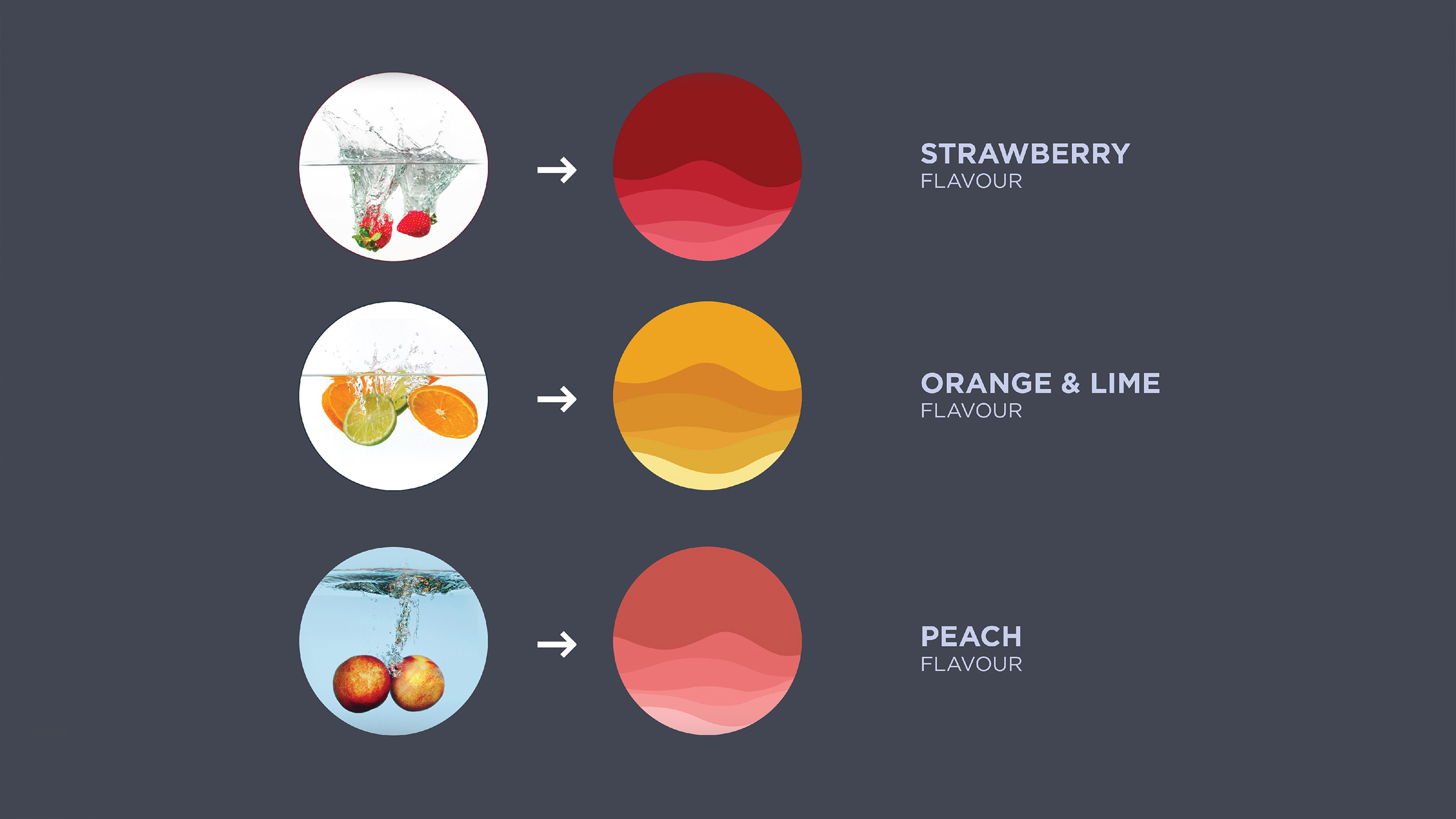
We used ocean waves like the ones used on the energy drink can,
to tie the products together. The colors are related to the fruits in each flavor.
